Python for the Finance Industry
Posted on Fri 12 April 2019 in Python • 3 min read
This is the first post in a series of posts dedicated for demonstrating how Python can be applied in the finance industry. Personally, the first thing that comes to mind when I think of the finance industry is the stock market. For fellow Australians, our main stock exchange is the Australian Securities Exchange (ASX). For those who are reading who are not familiar with stocks, there is a plethora of information around stocks across the internet.
When it comes to using Python with stocks, the very first thing that you will require, is data. Thankfully, there are multitudes of services out there which provide this data through application programming interfaces (APIs). The data is provided through APIs in a few common formats:
- JSON,
- XML,
- CSV.
For this post, I will be utilising the free service, Alpha Vantage, to request historical records of stock information on the ASX. For access to Alpha Vantage’s API, head to http://www.alphavantage.co/support/#api-key and register for a free API key. There is also documentation around testing if your API key is operational on the Alpha Vantage website.
Now that we have access to an API in which we can extract historical records of stock information in the ASX, it’s time to manipulate and analyse the data. As in my previous post Episode 8 – Anaconda, I recommend setting up a virtual environment or anaconda environment to install & manage dependencies of external libraries.
The packages required for this post in the series are:
- Pandas (For manipulating the data),
- Alpha_vantage (To access the historical records through an API),
- NumPy (For processing across the data),
- Matplotlib (For visualising and generate plots of the data).
To import these libraries into our Python code the following\ code is required:
1 2 3 4 | |
Now that we have imported the packages required to extract,\ process and display the data. The first step is to extract the data in a useful\ format from the Alpha Vantage API.
First declare a list with all the companies ASX names with the suffix “.AX” to denominate that it’s from the ASX. After that initialise an empty pandas dataframe to be filled with the data to analyse. Now iterate over the list, calling a request through the API to request the data that is required. There are multiple formats of data to be extracted through the API which is detailed in the Alpha_Vantage documentation. For this post, I have used the get_daily function from the timeseries object in alpha_vantage to extract the daily information on a stock for the past 20 years, in particular, the closing value.
1 2 3 4 5 6 7 8 9 10 | |
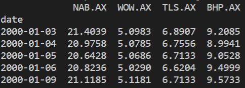
Now that the dataframe is full of closing values for the companie’s stock’s closing values, it’s time to begin processing. First of all, for any missing data or erroneous 0 values, the ffill() function is used to fill any missing value by propagating the last valid observation forward. After that, the timestamp on each row is forced to become the index of the dataframe and converted to a datetime type.
1 2 3 | |
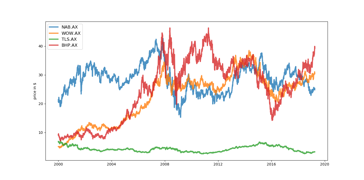
Now that the data has gone through it’s pre-processing phase, it’s time to begin plotting some figures. To begin, a basic figure, plotting a single for each company’s stock price over the past 20 years on a single line graph to enable comparison between the companies.
1 2 3 4 5 6 | |
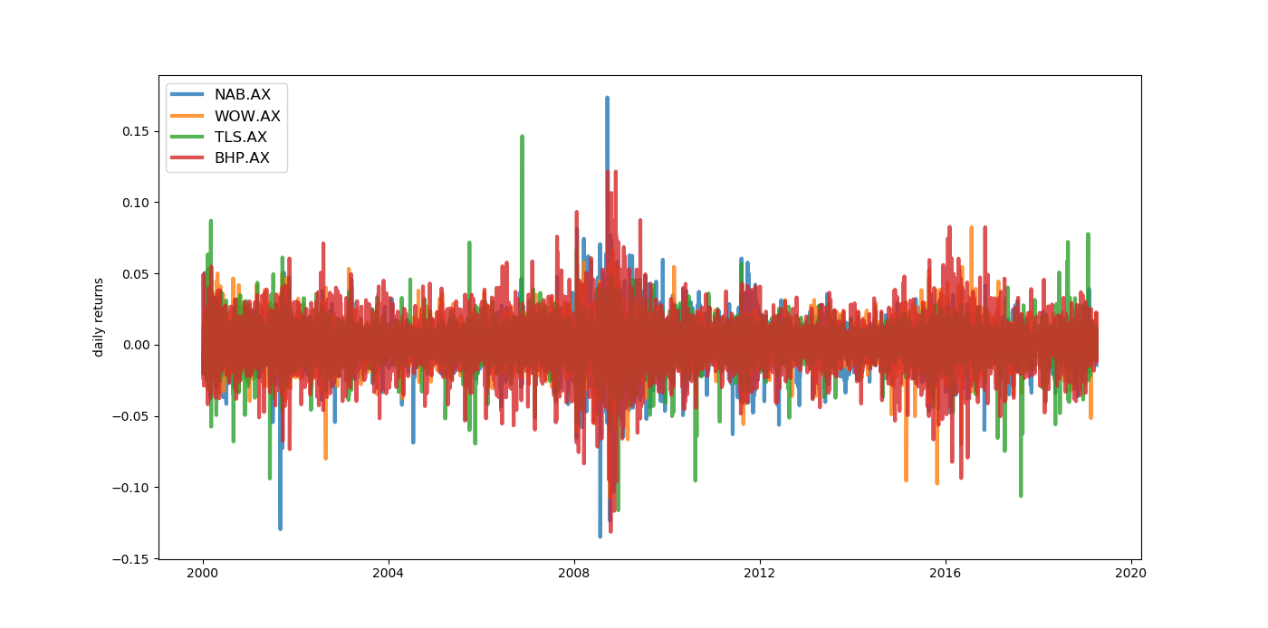
 Another way to plot this data is to show it as the percentage change from the day before AKA daily returns. By plotting the data in this way, instead of showing the actual prices, the graph is showing the stocks’ volatility.
1 2 3 4 5 6 7 8 | |
Now that we have some insight to the stocks’ data, the next post in this series will demonstrate a way to calculate a balanced portfolio from historical records using Modern Portfolio Theory.