COVID-19 Confirmed Cases NSW Australia - Animated Statistics over Time
Posted on Thu 14 May 2020 in Data Science • 1 min read
Recently, I had wanted to build a visualisation of the confirmed cases of COVID-19 in my home state NSW. This post is to cover the release of the visualisation on YouTube, and there is hopes to write future post(s) about building this visualisation & developing Pandas_Alive. Would love to hear others thoughts!
Disclaimer: I am not an epidemiologist, this is a personal project not a official report; see NSW Health website for official figures https://www.health.nsw.gov.au/Infectious/covid-19/Pages/stats-nsw.aspx.
Find the full animation at:
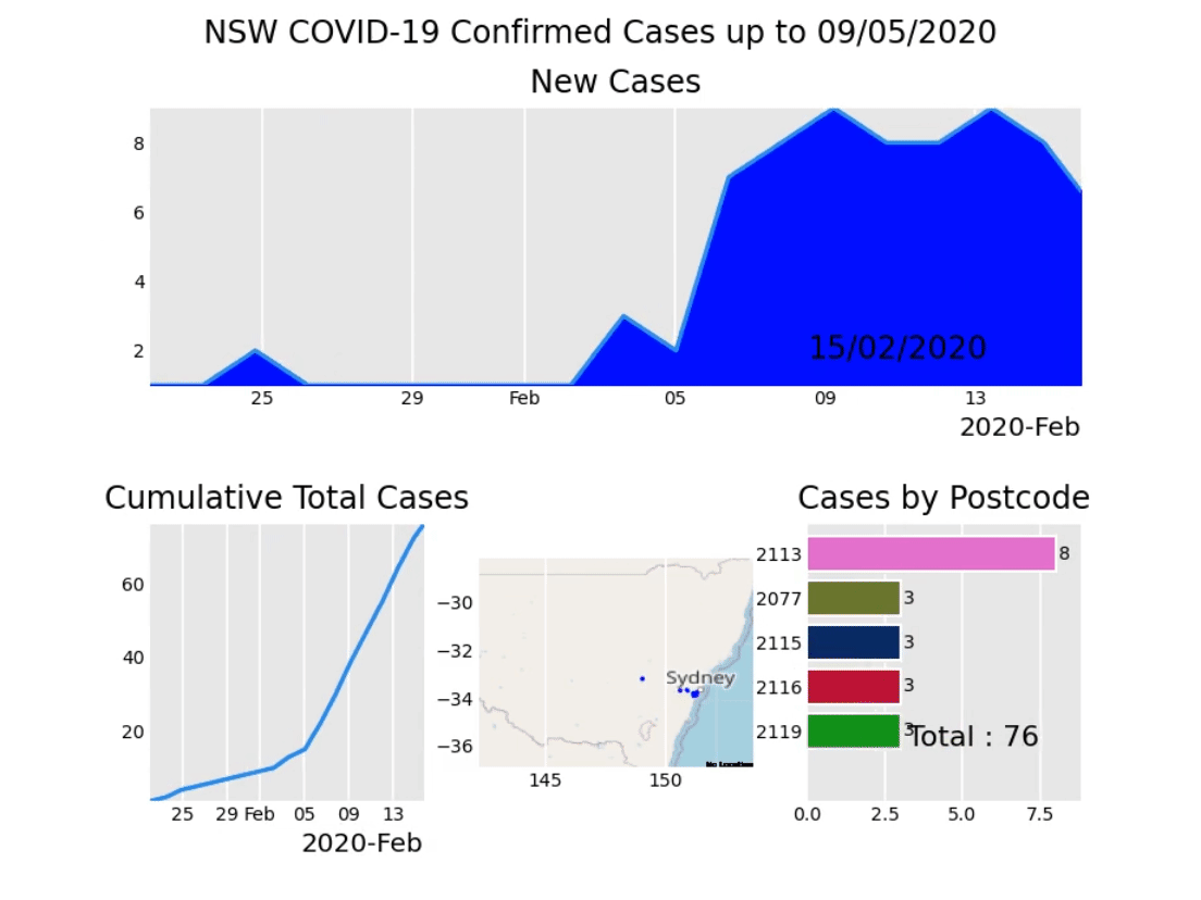
The 4 charts are comprised of:
- Area chart (top) of new cases on a daily accuracy
- Line chart (bottom left) of cumulative total cases
- Geo scatter chart (bottom center) of new cases on a daily accuracy by the latitude/longitude of postcode
- Bar chart race (bottom right) of total confirmed cases per postcode
This visualisation was built in Python with Pandas_Alive https://github.com/JackMcKew/pandas_alive. I set out to build this visualisation 2 weeks ago, and subsequently built Pandas_Alive to make generating animated charts from Pandas DataFrames with matplotlib as easy as df.plot_animated().
Data Source(s)
-
COVID-19 Confirmed Cases by Postcode NSW: https://data.nsw.gov.au/data/dataset/covid-19-cases-by-location
-
Lock down enforcement date of 01/04/2020 from: https://www.millsoakley.com.au/thinking/nsw-under-official-lockdown-full-details-of-new-government-directions-now-published/
-
Ruby Princess disembark date of 19/03/2020 from: https://www.theguardian.com/world/2020/mar/24/anatomy-of-a-coronavirus-disaster-how-2700-people-were-let-off-the-ruby-princess-cruise-ship-by-mistake