Creating Animated Plots with Pandas_Alive
Posted on Thu 21 May 2020 in Data Science • 5 min read
In this tutorial we'll learn how to create a series of animations using Pandas_Alive. This post is rendered in the style of a Jupyter Notebook. Find the source here: https://github.com/JackMcKew/jackmckew.dev/tree/master/content/2020/pandas_alive/notebooks/pandas_alive_demo.ipynb.
Pandas_Alive was created by me! I set out to develop this package to build a very specific data visualisation, which is also apart of a prior blog post which you can see at: https://jackmckew.dev/covid-19-confirmed-cases-nsw-australia-animated-statistics-over-time.html
pandas_alive python package
pandas_alive is a python package that automates the process of making these animations. Head over to the github repository to see even more examples!
Installation
Install with pip install pandas_alive
Supported Chart Types
See the README on GitHub for current chart types at https://github.com/JackMcKew/pandas_alive#currently-supported-chart-types
At the time of writing the currently supported chart types are:
- Horizontal Bar Chart Races
- Vertical Bar Chart Races
- Line Charts
- Scatter Charts
- Pie Charts
Requirements
pandas_alive utilises the matplotlib.animation function, thus requiring a writer library.
Ensure to have one of the supported tooling software installed prior to use!
Bar Chart Race
Firstly let's build a bar chart race of the population change by year in all the countries of the world.
Once pandas_alive is installed with pip install pandas_alive, we import the package, along with pandas.
import pandas_alive
import pandas as pd
Next we need to import the data!
We do the following steps:
Using
pandas, we can read the data into a DataFrame usingpd.read_csv, ensuring to use the keywordparse_dateson the Year column in our dataset.Next we rename the columns to make life easier.
We're only interested in years 1800 onwards, so we can make a selection and drop the data that isn't on or after the year 1800.
Finally we convert the 'Year' column into datetime format, read more about datetime format here: https://docs.python.org/3/library/datetime.html
# Data Source: https://ourworldindata.org/grapher/population-by-country
df = pd.read_csv('population-by-country.csv',parse_dates=['Year'])

# Rename columns
column_names = ['Country','Country Code','Year','Population']
df.columns = column_names

# Only years from 1800 onwards
df = df[df['Year'].astype(int) >= 1800]

# Convert Year column to datetime
df['Year'] = pd.to_datetime(df['Year'])

display(df)
As we can see, our data is currently in a 'long' format; where each row is one time point per subject. Meaning each row (country) will have data in multiple rows.
pandas_alive requires the data to be in a 'wide' format, where:
- Each row represents a single point/period in time
- Each column holds the value for a particular category (country in this case)
- The index contains the time component (optional, if not used ensure to use
interpolate_period=False)
To convert our data from 'long' to 'wide' format, we can use the pandas function pivot to achieve this!
For any missing data we fill this with 0 using
.fillna(0)
# Pivot data to turn from `long` to `wide` format
pivoted_df = df.pivot(index='Year',columns='Country',values='Population').fillna(0)

display(pivoted_df.head(5))
Now that our data is prepared in 'wide' format, we're ready to create the animation!
Ensuring that pandas_alive has been imported, we can now call .plot_animated() on our DataFrame. If a filename is passed, along with an extension (eg, .mp4, .gif), pandas_alive will export the animation to a file. Otherwise, pandas_alive creates an instance of the animation for use in pandas_alive.animate_multiple_plots().
We can configure settings of .plot_animated, such as:
n_visible- Change the number of visible bars on the plotperiod_fmt- Change the way the date is represented on the plot (eg, '%d/%m/%Y')title- Set a title for the plotfixed_max- Set the x-axis to be fixed from the lowest - biggest numberperpendicular_bar_func- Set the function to show a perpendicular bar (eg 'mean', 'min','max', custom function, etc)
There are many more settings which you can read more over at the documentation: https://jackmckew.github.io/pandas_alive/generated/pandas_alive.plotting.plot.html#pandas_alive.plotting.plot
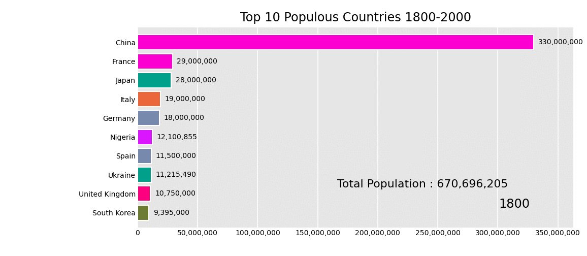
# Generate bar chart race
pivoted_df.plot_animated(filename='population-over-time-bar-chart-race.gif',n_visible=10,period_fmt="%Y",title='Top 10 Populous Countries 1800-2000',fixed_max=True,perpendicular_bar_func='mean')
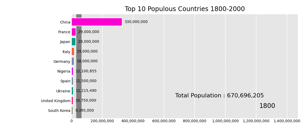
What if we wanted to show a custom function for each time period. This can be achieved with defining a function and returns a dictionary on where the label should be located. Let's show the total population for each time period in the bottom left.
def current_total(values):
    total = values.sum()
    s = f'Total Population : {int(total):,}'
    return {'x': .85, 'y': .2, 's': s, 'ha': 'right', 'size': 11}

# Generate bar chart race

pivoted_df.plot_animated(filename='population-over-time-bar-chart-race.gif',n_visible=10,period_fmt="%Y",title='Top 10 Populous Countries 1800-2000',fixed_max=True,perpendicular_bar_func='mean',period_summary_func=current_total)
Line Charts
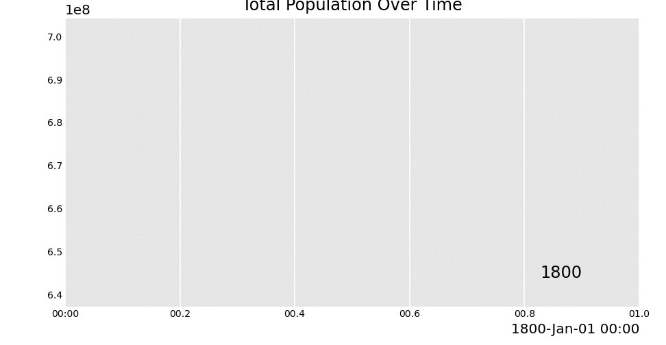
Let's show the total population over time.
Get the total population for each year by summing the entire row .sum(axis=1)
total_df = pivoted_df.sum(axis=1)

display(total_df)
Now let's create an animated line chart with this data using pandas_alive.
total_df.plot_animated(kind='line',filename="total-population-over-time-line.gif",period_fmt="%Y",title="Total Population Over Time")
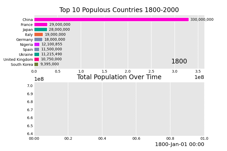
Combining Both Charts
Now that we've created a bar chart race & a line chart, let's combine the two charts into a single animation!
Luckily, pandas_alive makes this simple, as we can pass a list of animations we'd like to combine into pandas_alive.animate_multiple_plots.
bar_chart_race = pivoted_df.plot_animated(n_visible=10,period_fmt="%Y",title='Top 10 Populous Countries 1800-2000')
animated_line_chart = total_df.plot_animated(kind='line',period_label=False,title="Total Population Over Time")

pandas_alive.animate_multiple_plots('population-combined-charts.gif',[bar_chart_race,animated_line_chart])
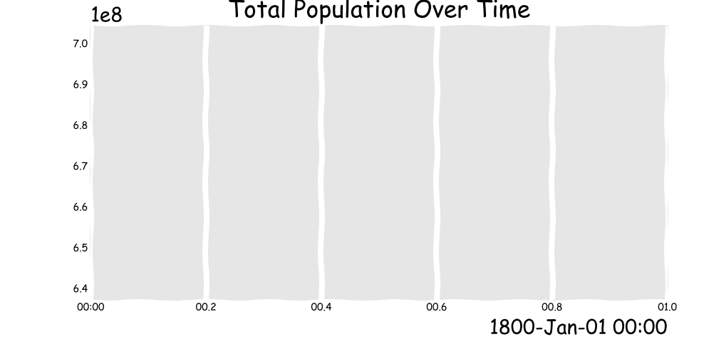
Obligatory XKCD Style Plot
XKCD is an amazing comic by one of my favourite authors Randall Munro. Even better, we can style our plots in the same style of the comit with plt.xkcd(). See more at https://matplotlib.org/3.1.1/api/_as_gen/matplotlib.pyplot.xkcd.html
import matplotlib.pyplot as plt

with plt.xkcd():
    animated_line_chart = total_df.plot_animated(filename='xkcd-line-plot.gif',kind='line',period_label=False,title="Total Population Over Time")