Episode 4 - Visualization
Posted on Fri 14 December 2018 in Python • 1 min read
In an ever growing world of data, every person perceives data in their own personalized way. This calls for data analysis to be visualized in a clear straightforward way so that it is accessible by anyone may come into contact with the system.
By further making the data analysis system interactive, this adds an extreme amount of personalization to the analysis. Allowing the user to interact with the data set in their own way.
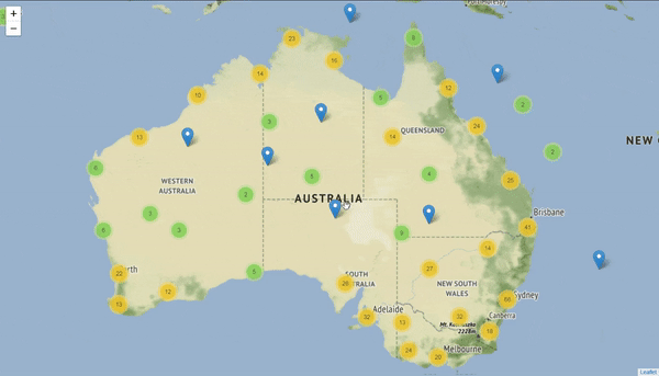
With the help of python, it was simple to create an interactive map from a data set containing geographic co-ordinates allowing users to visually determine where they would like to select their data set from. This can then be embedding into any web browser or mobile device allowing for extreme flexibility and interactivity.