Geopandas and Pandas Alive
Posted on Fri 12 June 2020 in Python • 6 min read
Geopandas and Pandas_Alive
Following on from a previous post on making animated charts with pandas_alive, let's go into generating animated charts specifically for geospatial data with geopandas. Support for geopandas was introduced into pandas_alive in version 0.2.0, along with functionality to interface with contextily for enabling basemaps. The visualisation(s) we will make today, are initially was pandas_alive was created for!
When setting up geopandas & pandas_alive on Windows, the recommended set up is using Anaconda as geopandas requires GDAL, which is not a trivial process to set up on Windows. Luckily Anaconda distributes GDAL along with geopandas so we don't have to worry about it. We also need to install descartes (support for plotting polygons) and contextily for basemap support. These can be installed with:
descartes:conda install -c conda-forge descartescontextily:conda install -c conda-forge contextily
pandas_alive also supports progress bars with tqdm, this can be installed via conda install tqdm and enabled using the enable_progress_bar=True keyword in plot_animated()
First off let's check out the end-result visualisation we'll be building today:
Now let's get started, as always we begin by importing all the neccessary libraries.
import geopandas
import pandas as pd
import pandas_alive
import contextily
import matplotlib.pyplot as plt

import urllib.request, json
The data we wish to visualise is hosted through an API, so we will use urllib to load the json response and then find the dataset link (provided as a csv). Once we determine what the link is, we can use pandas to read the csv directly from the url. We also read in a dataset of matching geospatial co-ordinates to the postcodes.
with urllib.request.urlopen(
    "https://data.nsw.gov.au/data/api/3/action/package_show?id=aefcde60-3b0c-4bc0-9af1-6fe652944ec2"
) as url:
    data = json.loads(url.read().decode())

# Extract url to csv component
covid_nsw_data_url = data["result"]["resources"][0]["url"]

# Read csv from data API url
nsw_covid = pd.read_csv(covid_nsw_data_url)

# Source for postcode dataset https://www.matthewproctor.com/australian_postcodes
postcode_dataset = pd.read_csv("data/postcode-data.csv")

display(nsw_covid.head())
display(postcode_dataset.head())
This data isn't in the format we need it to be, so let's do some preprocessing, in particular we:
- Fill in any gaps (with error value 9999)
- Convert the date string to a datetime object
- Groupby to get number of cases by date & postcode
- Unstack the multi-index that groupby returns
- Drop the unused column level
- Fill any missing values now with 0 cases (as these would be unprovided)
# Prepare data from NSW health dataset
nsw_covid = nsw_covid.fillna(9999)
nsw_covid["postcode"] = nsw_covid["postcode"].astype(int)

# Convert the date time string to a datetime object
nsw_covid['notification_date'] = pd.to_datetime(nsw_covid['notification_date'],dayfirst=True)

grouped_df = nsw_covid.groupby(["notification_date", "postcode"]).size()
grouped_df = pd.DataFrame(grouped_df).unstack()
grouped_df.columns = grouped_df.columns.droplevel().astype(str)

grouped_df = grouped_df.fillna(0)
grouped_df.index = pd.to_datetime(grouped_df.index)

cases_df = grouped_df

cases_df.to_csv('data/nsw-covid-cases-by-postcode.csv')
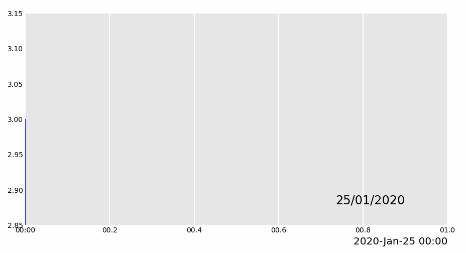
Now we can start by creating an area chart, and labelling any events in particular with vertical bars.
from datetime import datetime

bar_chart = cases_df.sum(axis=1).plot_animated(
    filename='area-chart.gif',
    kind='line',
    label_events={
        'Ruby Princess Disembark':datetime.strptime("19/03/2020", "%d/%m/%Y"),
        'Lockdown':datetime.strptime("31/03/2020", "%d/%m/%Y")
    },
    fill_under_line_color="blue",
    enable_progress_bar=True
)
Now it's time to prepare the dataset for our geospatial visualisations with geopandas. In particular:
- Drop any invalid longitudes / latitudes from our postcode dataset
- Drop any longitudes / latitudes that are 0
- Match the postcodes in each dataset to retrieve the equivalent longitude / latitude
- Remove the redundant/duplicated columns
- Package into a geopackage (ensure to keep the index column separate)
# Clean data in postcode dataset prior to matching

grouped_df = grouped_df.T
postcode_dataset = postcode_dataset[postcode_dataset['Longitude'].notna()]
postcode_dataset = postcode_dataset[postcode_dataset['Longitude'] != 0]
postcode_dataset = postcode_dataset[postcode_dataset['Latitude'].notna()]
postcode_dataset = postcode_dataset[postcode_dataset['Latitude'] != 0]
postcode_dataset['Postcode'] = postcode_dataset['Postcode'].astype(str)

# Build GeoDataFrame from Lat Long dataset and make map chart
grouped_df['Longitude'] = grouped_df.index.map(postcode_dataset.set_index('Postcode')['Longitude'].to_dict())
grouped_df['Latitude'] = grouped_df.index.map(postcode_dataset.set_index('Postcode')['Latitude'].to_dict())
gdf = geopandas.GeoDataFrame(
    grouped_df, geometry=geopandas.points_from_xy(grouped_df.Longitude, grouped_df.Latitude),crs="EPSG:4326")
gdf = gdf.dropna()

# Prepare GeoDataFrame for writing to geopackage
gdf = gdf.drop(['Longitude','Latitude'],axis=1)
gdf.columns = gdf.columns.astype(str)
gdf['postcode'] = gdf.index
gdf.to_file("data/nsw-covid19-cases-by-postcode.gpkg", layer='nsw-postcode-covid', driver="GPKG")
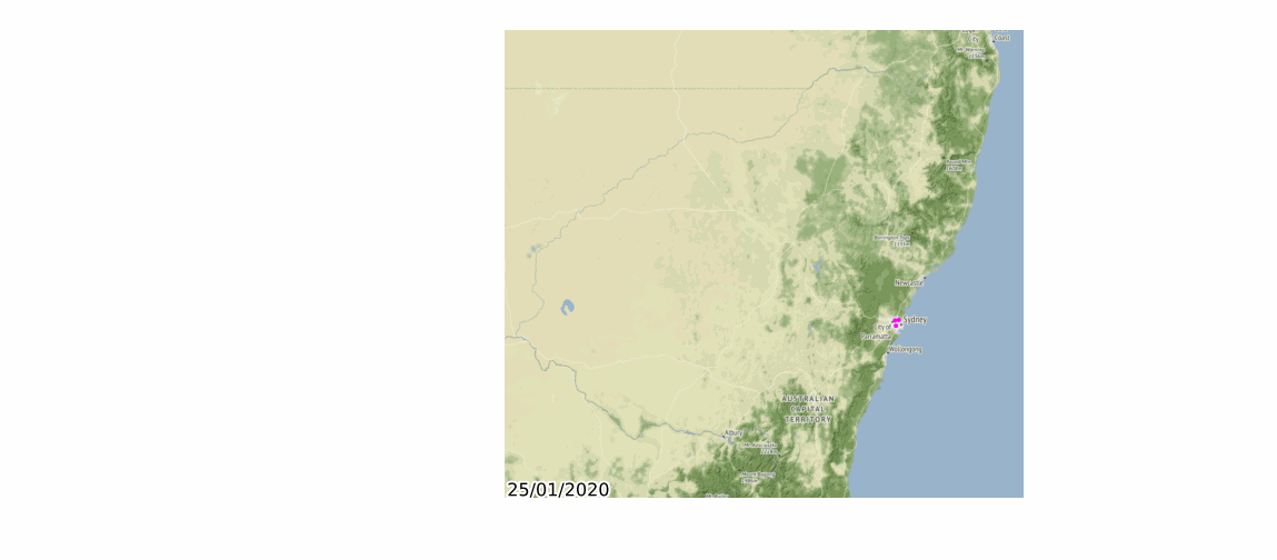
Before we merge together all the charts, let's plot the prepared geospatial data on it's own.
# Prepare GeoDataFrame for plotting
gdf.index = gdf.postcode
gdf = gdf.drop('postcode',axis=1)
gdf = gdf.to_crs("EPSG:3857") #Web Mercator

map_chart = gdf.plot_animated(filename='map-chart.gif',title="Cases by Location",basemap_format={'source':contextily.providers.Stamen.Terrain},cmap='cool')
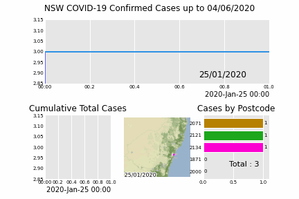
Finally let's merge all these charts together into a single chart!
grouped_df = pd.read_csv('data/nsw-covid-cases-by-postcode.csv', index_col=0, parse_dates=[0])

line_chart = (
    grouped_df.sum(axis=1)
    .cumsum()
    .fillna(0)
    .plot_animated(kind="line", period_label=False, title="Cumulative Total Cases")
)


def current_total(values):
    total = values.sum()
    s = f'Total : {int(total)}'
    return {'x': .85, 'y': .2, 's': s, 'ha': 'right', 'size': 11}

race_chart = grouped_df.cumsum().plot_animated(
    n_visible=5, title="Cases by Postcode", period_label=False,period_summary_func=current_total
)

import time

timestr = time.strftime("%d/%m/%Y")

plots = [bar_chart, line_chart, map_chart, race_chart]

from matplotlib import rcParams

rcParams.update({"figure.autolayout": False})

figs = plt.figure()
gs = figs.add_gridspec(2, 3, hspace=0.5)
f3_ax1 = figs.add_subplot(gs[0, :])
f3_ax1.set_title(bar_chart.title)
bar_chart.ax = f3_ax1

f3_ax2 = figs.add_subplot(gs[1, 0])
f3_ax2.set_title(line_chart.title)
line_chart.ax = f3_ax2

f3_ax3 = figs.add_subplot(gs[1, 1])
f3_ax3.set_title(map_chart.title)
map_chart.ax = f3_ax3

f3_ax4 = figs.add_subplot(gs[1, 2])
f3_ax4.set_title(race_chart.title)
race_chart.ax = f3_ax4

timestr = cases_df.index.max().strftime("%d/%m/%Y")
figs.suptitle(f"NSW COVID-19 Confirmed Cases up to {timestr}")

pandas_alive.animate_multiple_plots(
    'nsw-covid.gif',
    plots,
    figs
)
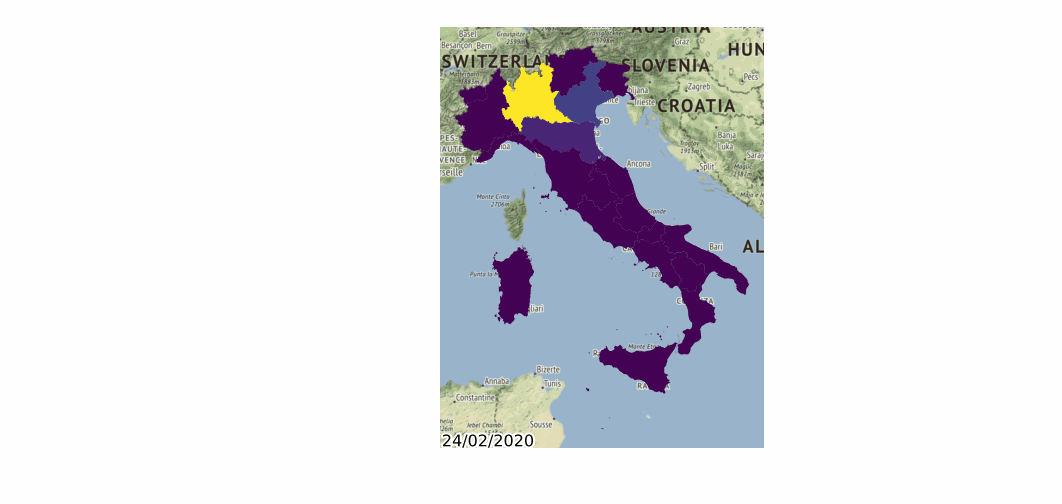
Pandas_Alive also supports animating polygon GeoDataFrames!
import geopandas
import pandas_alive
import contextily

gdf = geopandas.read_file('data/italy-covid-region.gpkg')
gdf.index = gdf.region
gdf = gdf.drop('region',axis=1)

map_chart = gdf.plot_animated(filename='examples/example-geo-polygon-chart.gif',basemap_format={'source':contextily.providers.Stamen.Terrain})